As a UX/UI Design Intern for Ardent Labs, I was tasked with the project of redesigning the Ardent Academy website. I was solely responsible for strategizing, researching, and designing the new website.
Ardent Academy is a learning center chain serving the Orange County area. They aim to foster growth and maximize the intellectual potential of gifted children. The Ardent Academy website acts as an online hub for information about Ardent Academy.
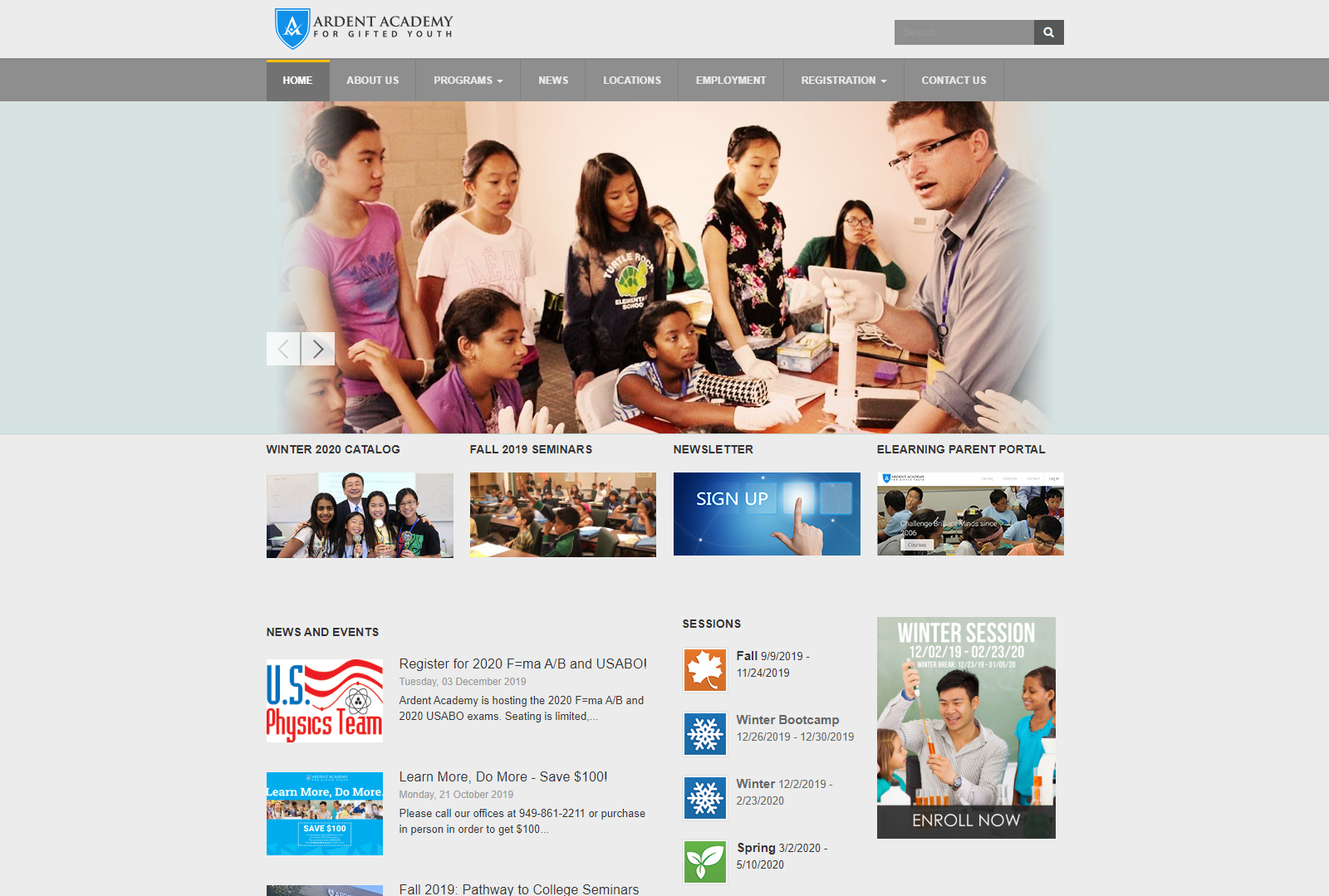
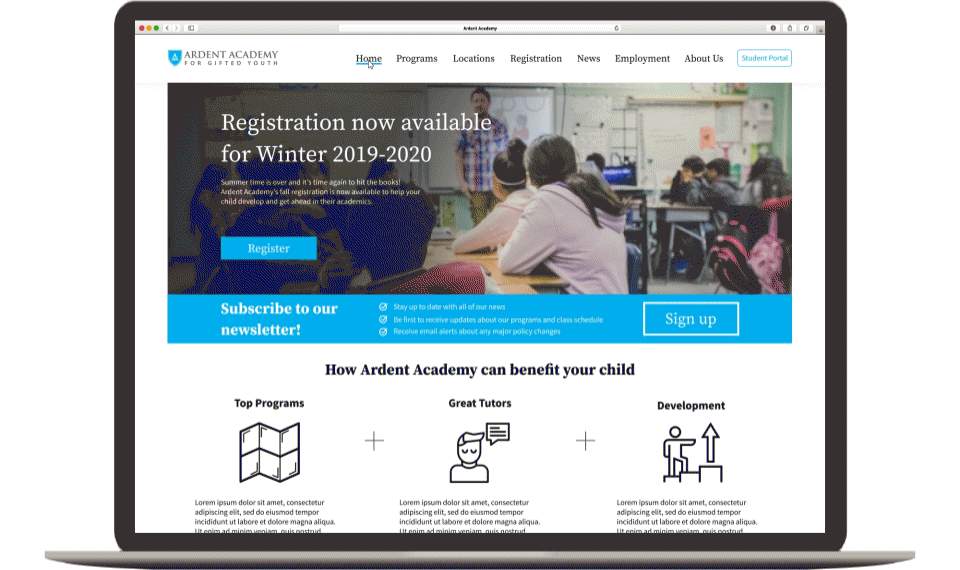
The current design is unfocused, cluttered, full of redundancies, and displays information in a way that is difficult to digest. This design has been used for a very long time and definitely shows its age.
As a design intern, I was given the responsibility of redesigning the Ardent Academy website. My goal for this project was to optimize the user experience to be modern, streamlined, and intuitive. As the online face of Ardent Academy, it is crucial that its website matches its mission, tone, and professionalism.
Working under Dr. James Li, the founder of Ardent Academy, I was given the freedom and responsibility to plan out the project’s research activities and timetable. For research, I chose to develop user personas and then conduct a competitive analysis, heuristic evaluation and card sorting. I felt these activities were best for evaluating the current website and for learning exactly how it can be improved to best suit our users. I typically gave a week between each activity to allow for an appropriate amount of time for research and analysis. For the design phase, I laid out plans for brainstorming and sketching, wireframes and mockups, and prototyping.

The very first step in this project was understanding who our users are and their needs. Developing personas would allow us to maintain focus when designing for our users. In a meeting with Dr. Li, we concluded that the Ardent website has three typical users:
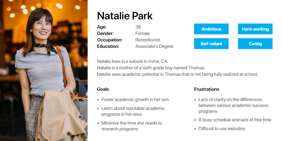
This user is someone who wants to foster their child's proficiencies and interests in academics and wants to enroll their child into a program which can help them achieve that. The user experience should be tailored in a way which allows them to find the information they need and enroll in a program as easily.
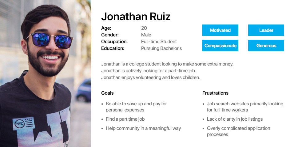
This user is looking for a job and the user experience should be streamlined so that this user can find all of the information they need and apply to a job as easily and quickly as possible.
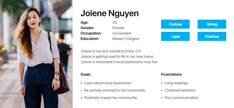
This user encapsulates the “everyone else”. These are curious people who land on the website, with the potential to become customers. This is a broad group but their main purpose is discovering general information about Ardent Academy. The user experience should be streamlined so that this type of user can navigate seamlessly between different pages while having information displayed in a way that it is easily understood at a glance.
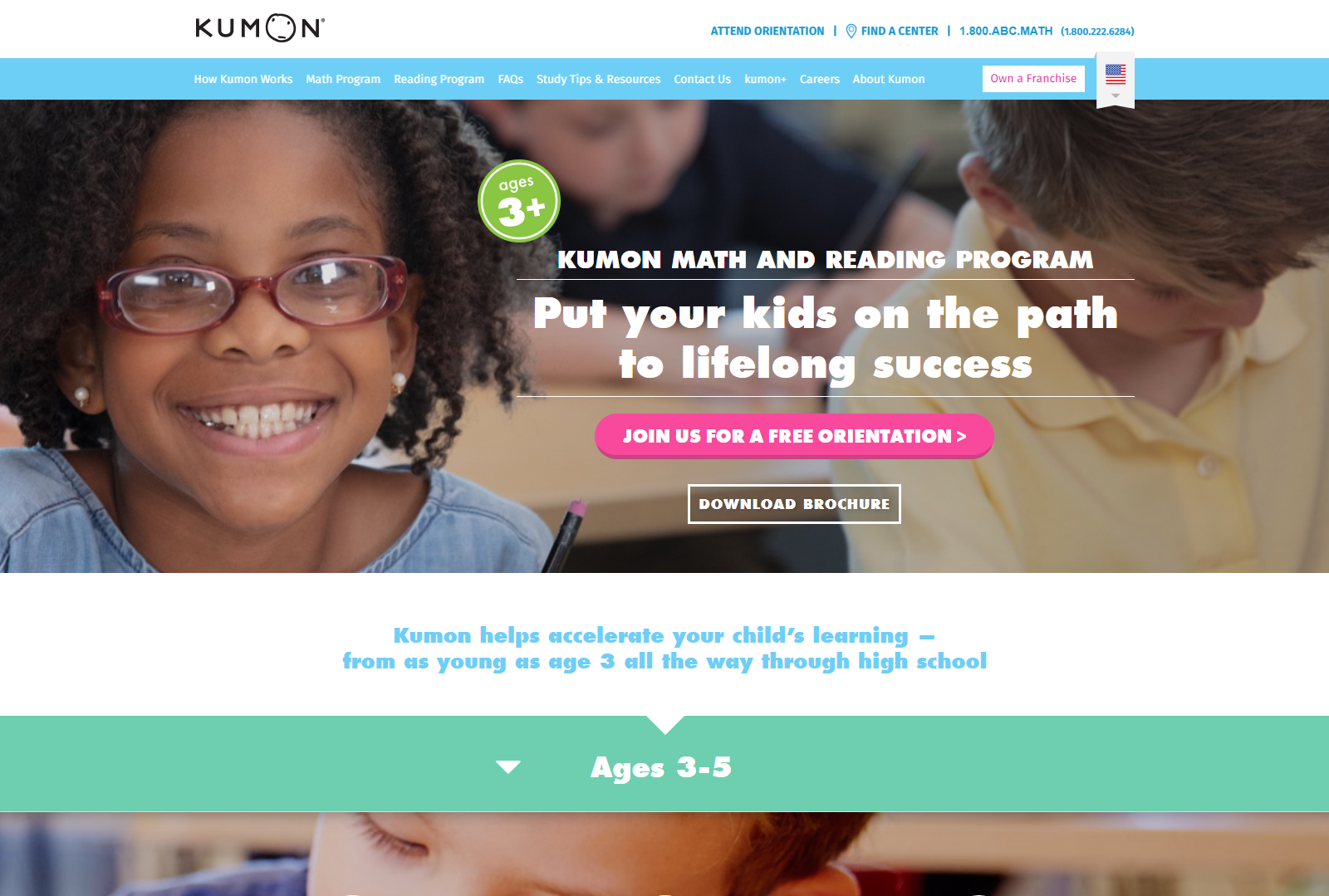
The next step was evaluating the competition. I was given a list of Ardent Academy’s main competitors. I visited their websites to discover who their users are, evaluate how they design their user experiences, and understand their advantages and disadvantages compared to the Ardent Academy website. Below are a summary of my findings:
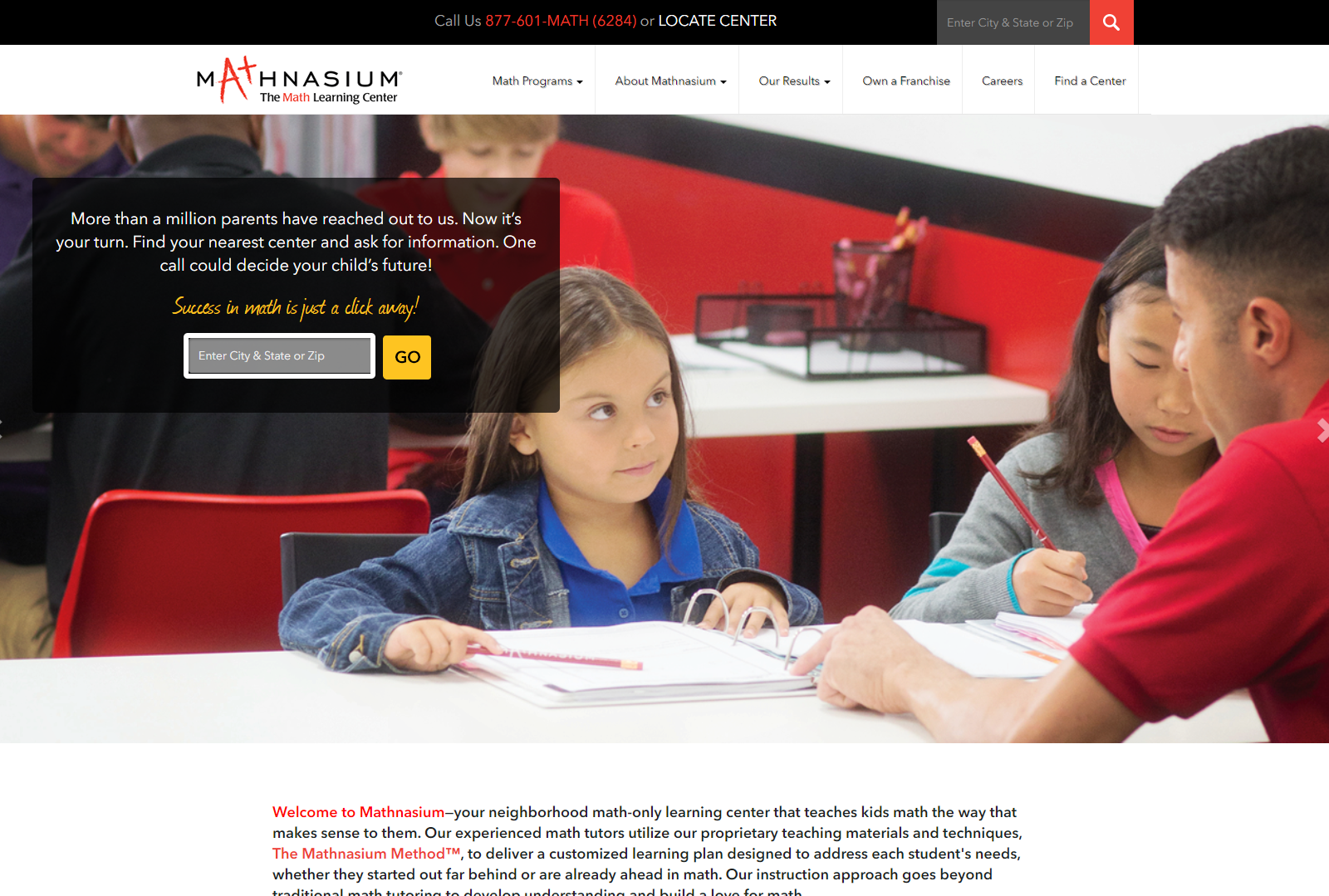
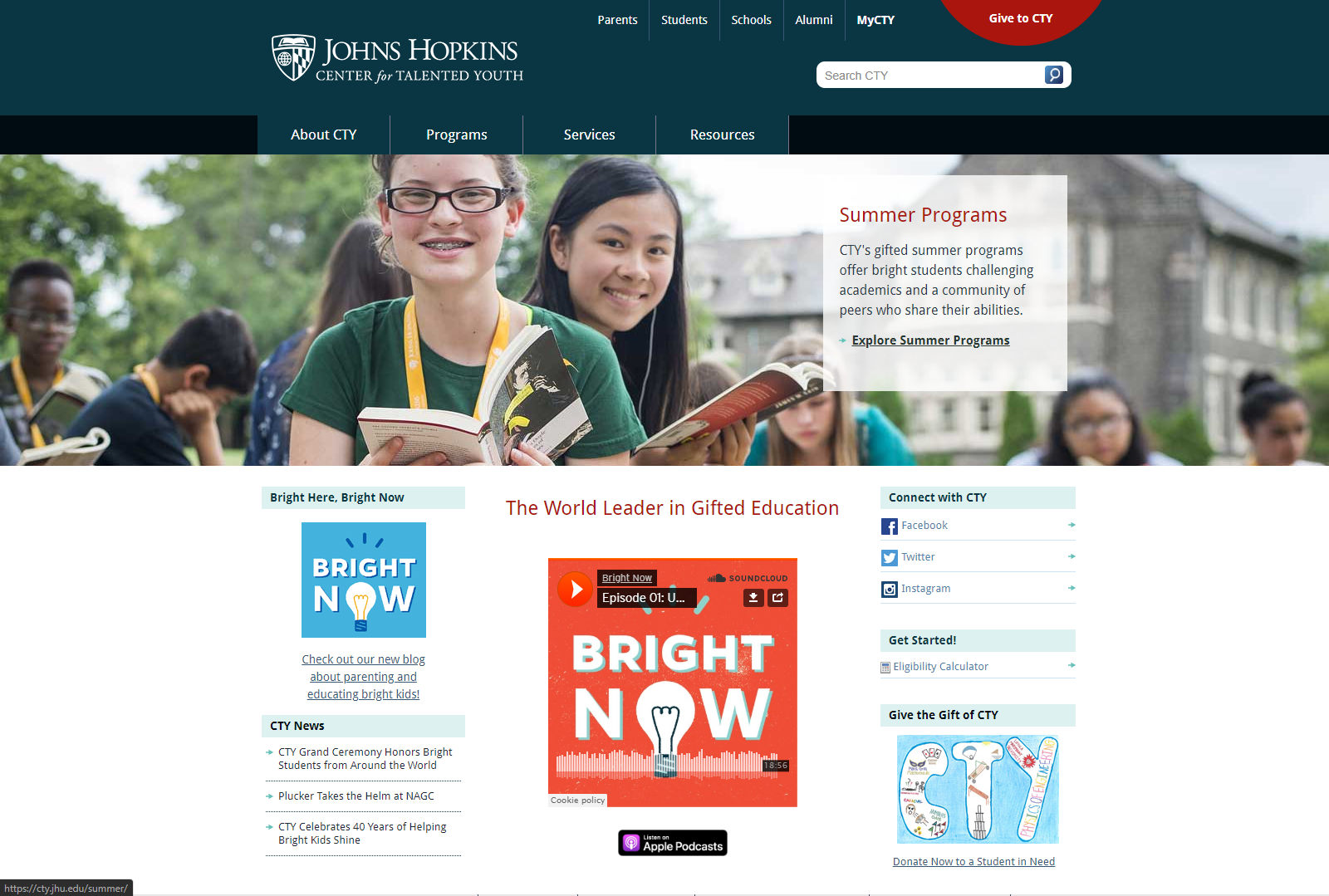
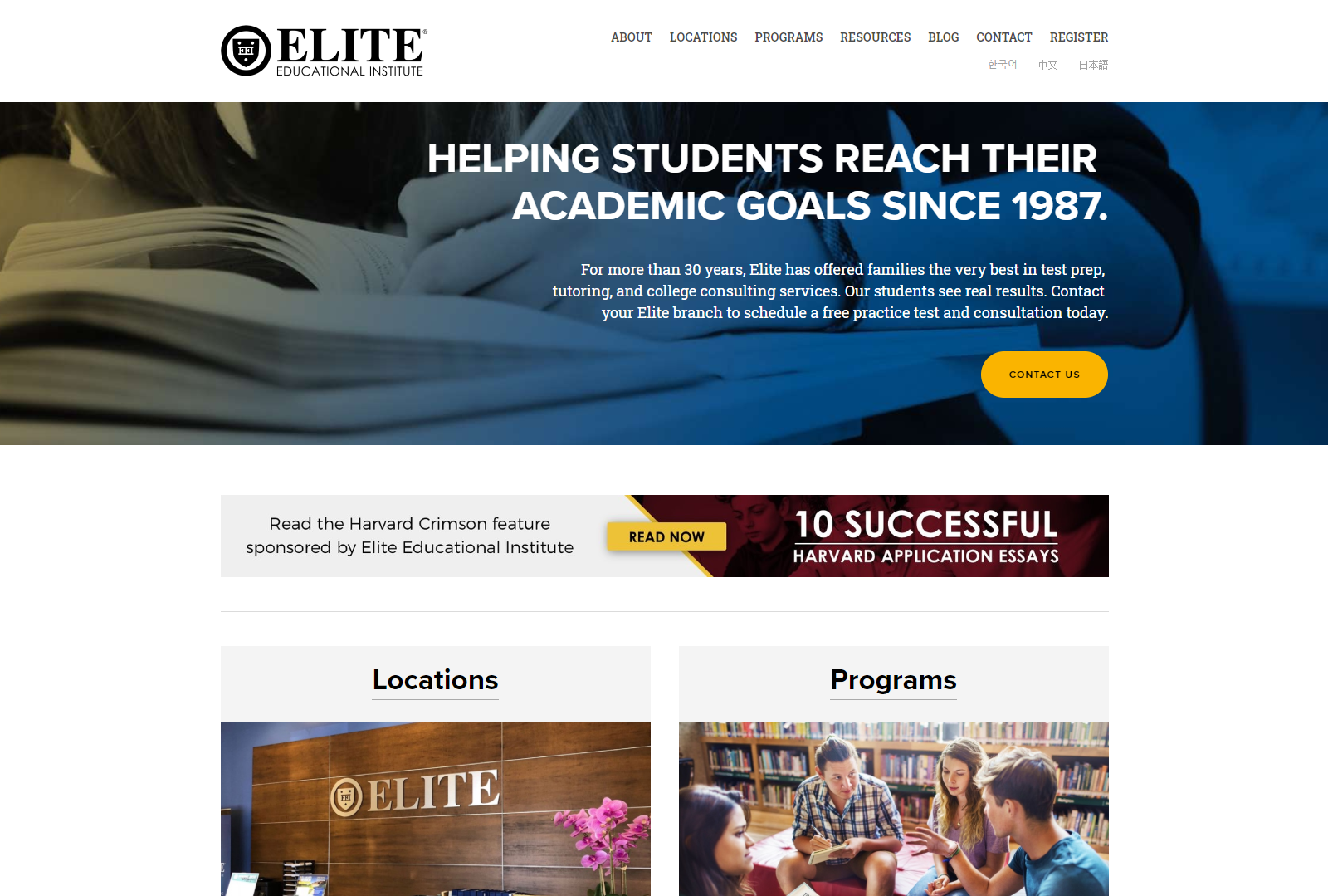
When compared to its competitors’ websites, the Ardent Academy website lacks a thoughtful user flow, focus, and calls to action. It displays information poorly through inconsistent and cluttered page layouts with an uninteresting visual presentation.
After getting a high-level overview of what can be improved, the next step was to dive into the smaller details. This activity's purpose was to thoroughly inspect the Ardent Academy website's user interface and be very critical, as to provide insight into what should be in the website’s redesign.
The heuristics I chose are a mix of Nielsen's 10 Usability Heuristics and Schneiderman’s 8 Golden Rules of Interface Design. I selected the following heuristics for their relevance to the information-focused type of website we’re designing and the specific tasks that are done on the Ardent Academy website.
The website has poor consistency overall. Typography and use of color are not consistent. There are many instances where text overflows unintentionally due to poor CSS. This poor consistency makes it difficult for the user to know what to expect and gives off a sense of low-quality and inattention.
The website’s design is filled with wasteful, confusing, redundant, and unnecessary clutter. This clutter makes it very hard for users to know what to focus on and find the information they need.
Most issues are minor and can easily be fixed and redesigned. Overall, the page has adequate user control and freedom.
The website currently has issues with short term memory load. Many processes are a burden on the user. Tasks like applying for a job or registering for a program require many different pages and is not a seamless experience. This makes the end goal more difficult for the user to reach.
For the most part, the website uses real world language. However, an area of improvement is how the text is written. It can be more focused towards the target user and minimized for the most important information. A possible area of improvement can be to use icons to quickly convey information.
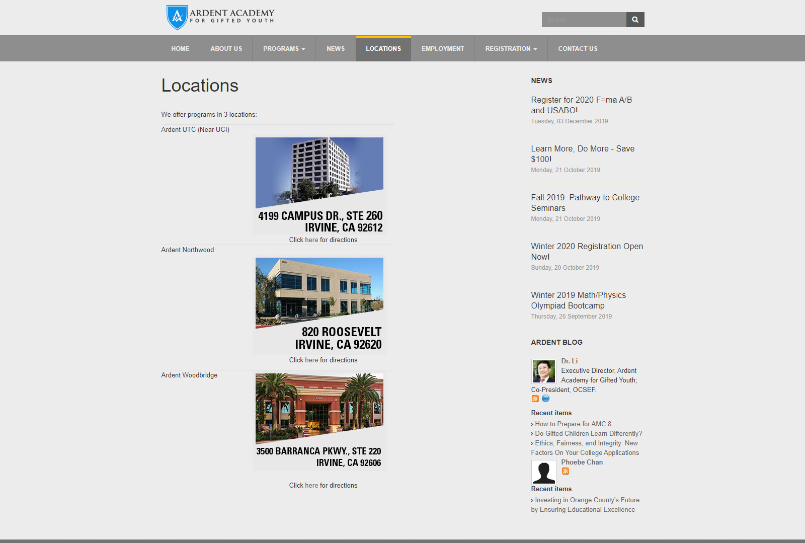
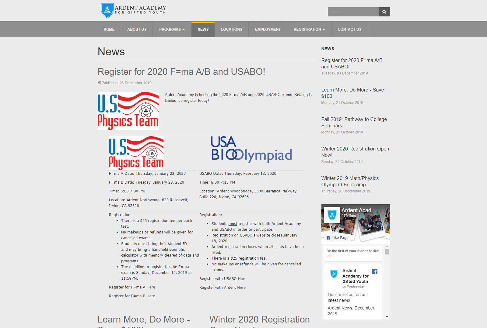
Currently, the website itself has many errors itself. Therefore, using the website will inherently lead to errors. The events page is completely empty, the calendar module is not useful, the search bar leads to unhelpful search results. These modules need to be fixed or removed altogether for a seamless user experience.
After discovering specific deficiencies in the current design, the next step was improving the information architecture. I conducted a closed card sorting to evaluate and optimize the information architecture of the website.
The card sorting was conducted remotely over the internet using a website called OptimalWorkshop. I had 10 participants ranging from current Ardent Academy customers, students, and working professionals.
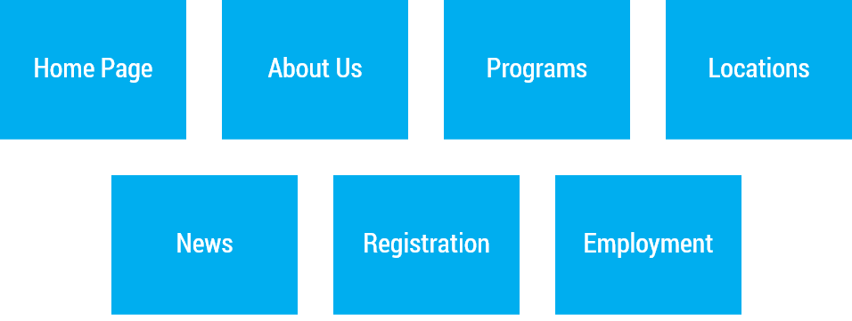
The participants were given 19 cards which were chosen based on what information currently exists on the current website and what will be in the redesign:
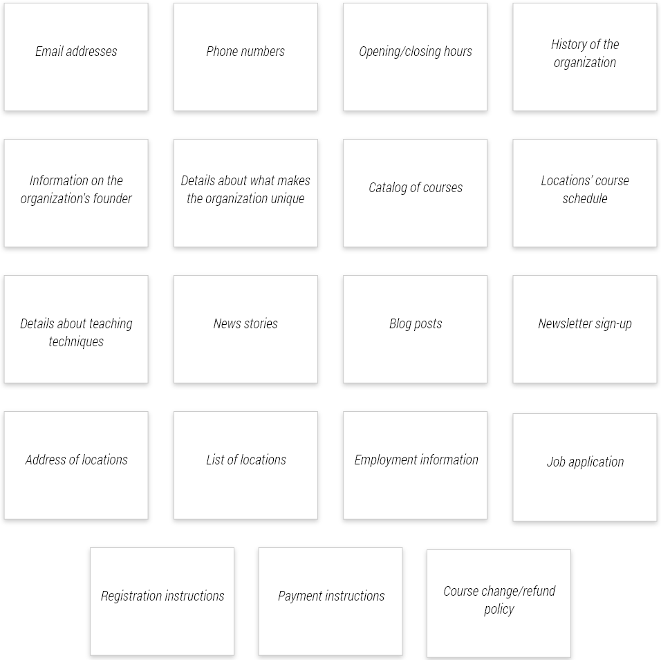
Participants were given 7 categories to sort those cards into, which represented the different web pages that will be in the redesigned website. These categories were chosen from the project goal of simplifying the website, decreasing the number of pages from 9 to 7.
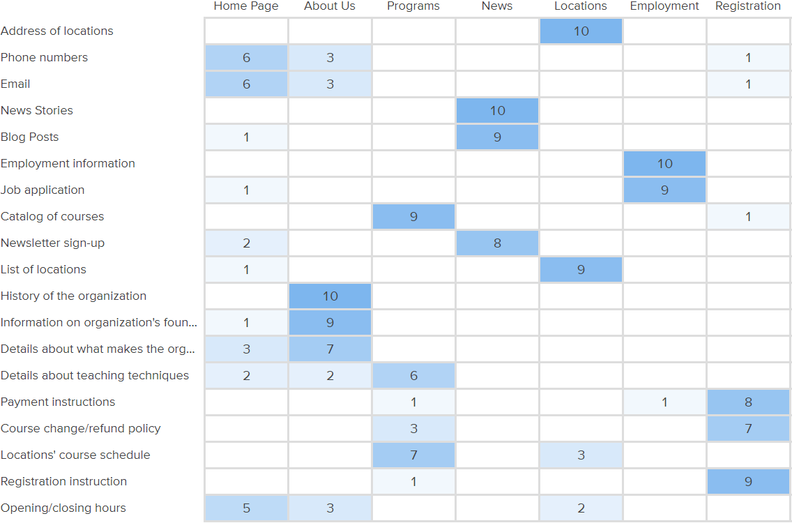
The results matrix above shows how participants voted, with the cards on the y-axis and the categories on the x-axis. Numbers represent the fraction of the population who voted for the card to be placed under the specified category. Highlighted squares represent the most voted category for a given card. As my sample size was 10, every 10% increment is equal to one vote.
This activity allowed me to see users’ expectations for where information would be categorized. With this data, Dr. Li and I developed several iterations of the information architecture taking into account the data, business needs, and our best judgement.
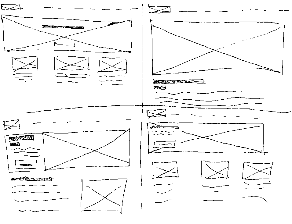
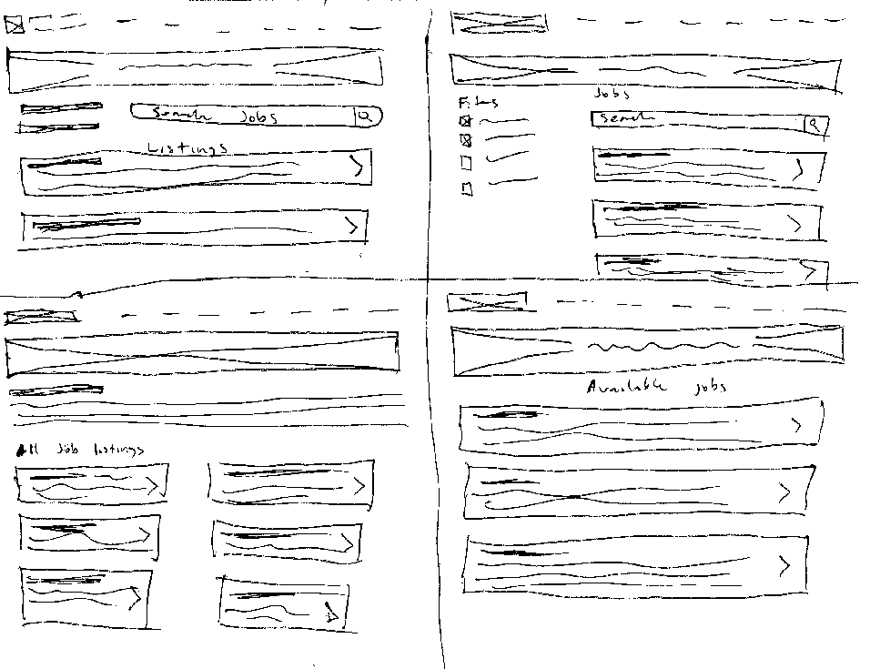
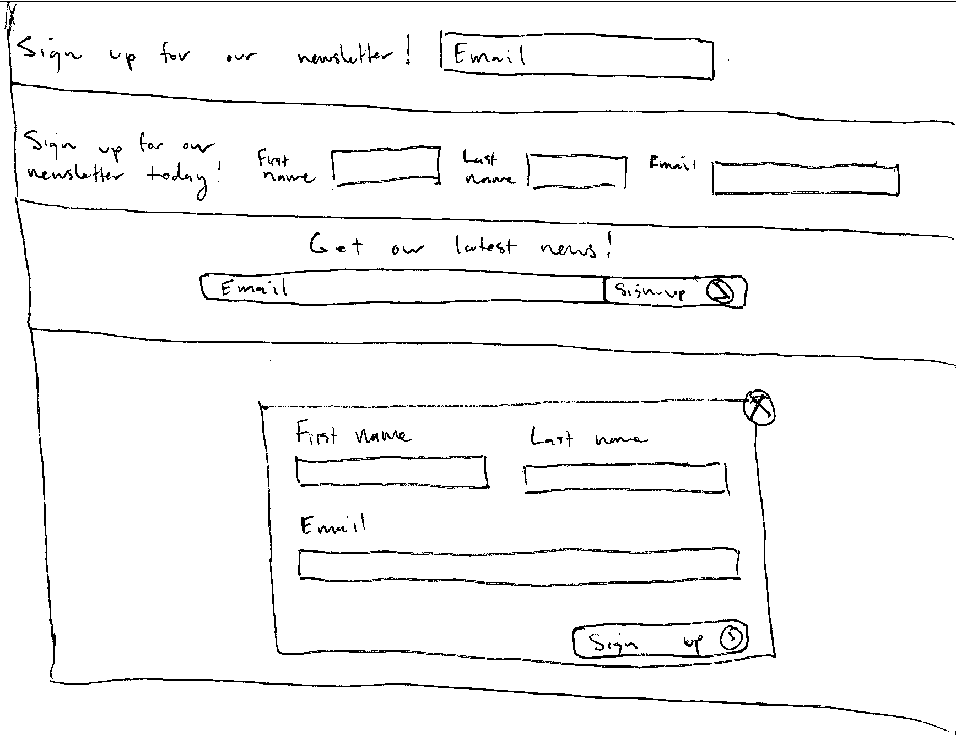
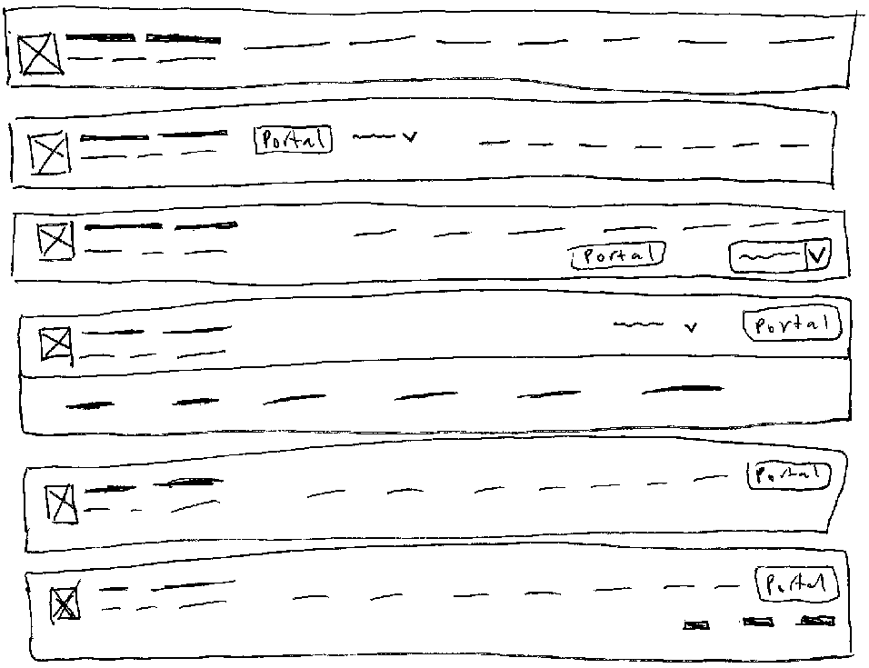
To begin the design process, I began by exploring ideas for the reused components of the website such as the navbar, footer, and newsletter signup. After feedback and iteration on those designs, I sketched out designs for each page, taking into account what I learned from my research.
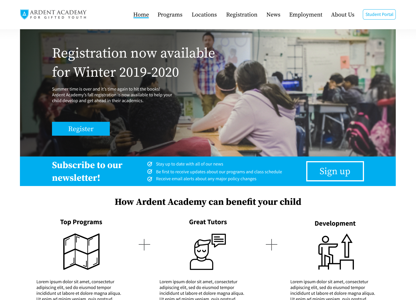
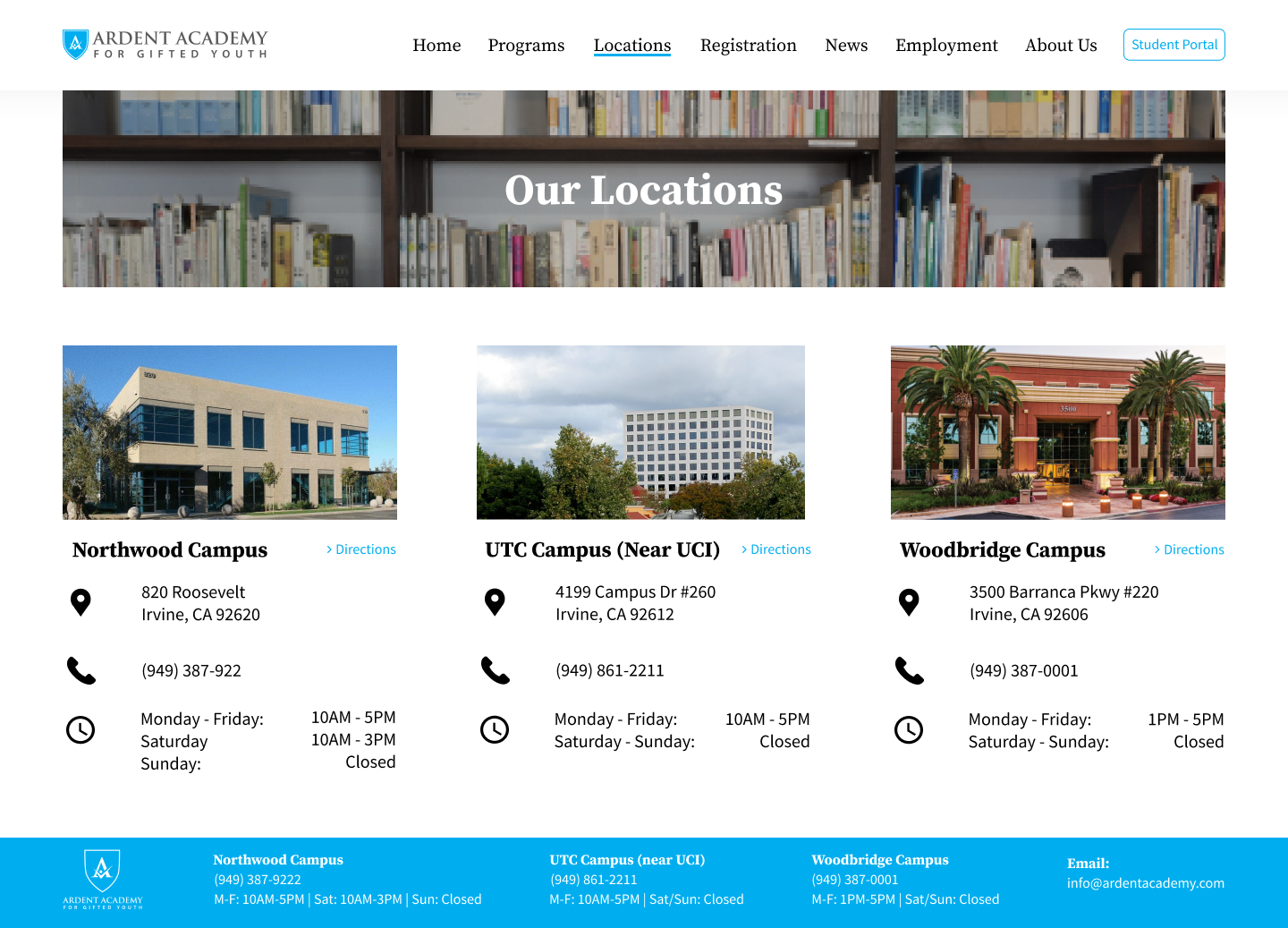
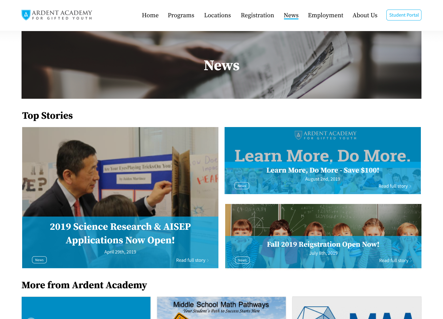
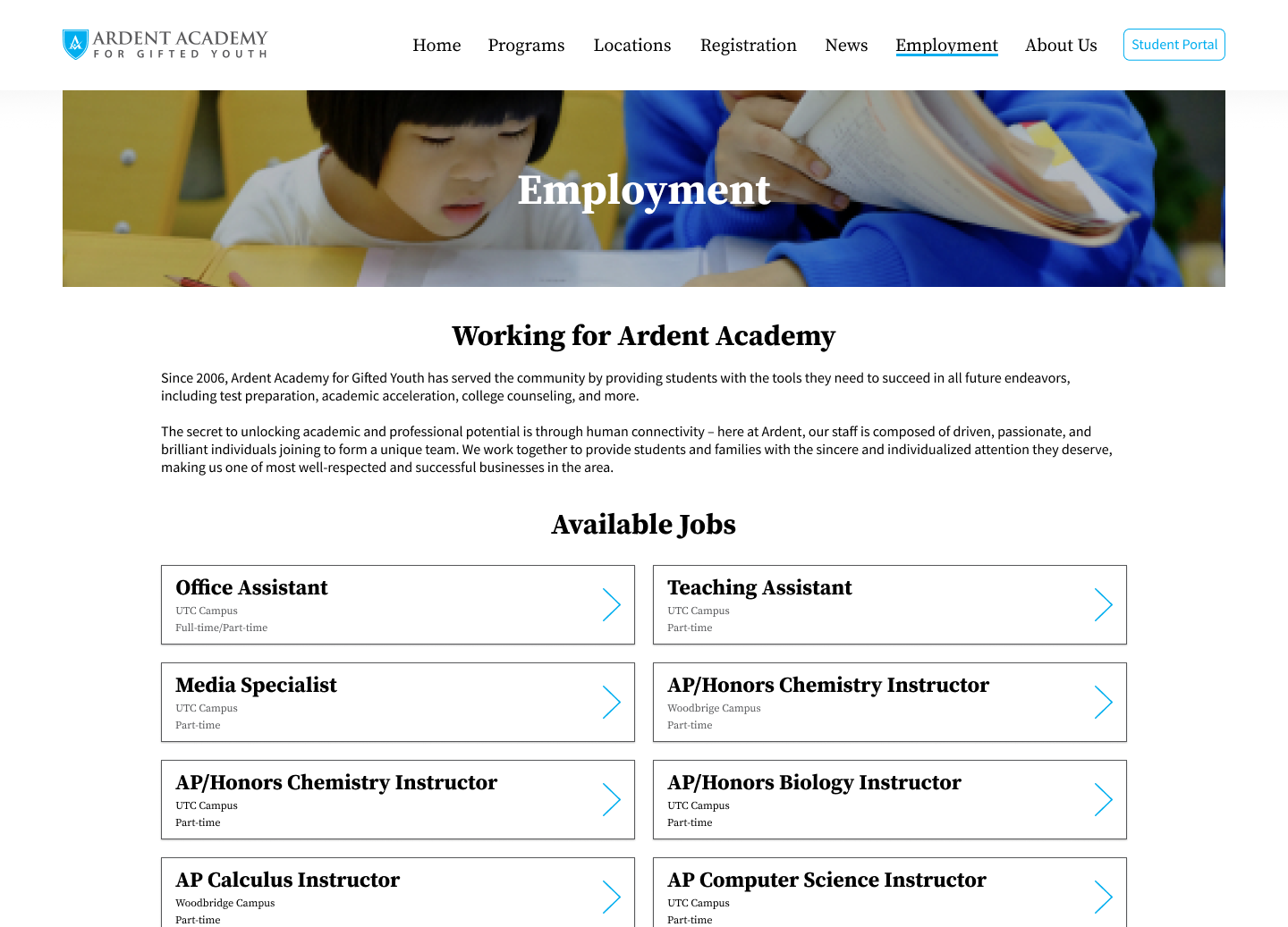
After ideating and finalizing the low-fidelity assets, I began the high-fidelity mockups in Figma. I experimented and explored different typography and colors before landing on the appropriate mix for the mood of the website. Below are a selection of mockups, however the full prototype can be viewed further below.
Unfortunately, circumstances did not allow me to stay and see out the development of the website. Many mockups have placeholder text because the rewritten content was not ready before I had to leave. I transferred my research and design assets to Ardent Labs, so that they can see out the rest of the project. The website has yet to be developed and I look forward to seeing it online!
This was my most comprehensive project yet. I had the opportunity to lay out the project’s schedule, design and iterate with senior feedback, and gather data from real customers. This all contributed to what was a very valuable experience for me as a designer. I would have loved to see the project through to launch and I look forward to being able to do that in future projects. Overall, I am happy with the work I was able to produce and the experience I had working on this project. Thank you to Dr. Li and everyone at Ardent Labs for the opportunity to learn, grow, and contribute to the great work done at Ardent Academy.