As part of a redesign project for a 10-week course, MyUCI is a redesign of UC Irvine's course enrollment process with the goal of unifying all related websites into one package to improve usability, efficiency and increase user satisfaction.
For Fall, Winter, and Spring enrollment, UC Irvine currently offers three different websites which altogether make up the course enrollment system. To obtain relevant course information and enroll in classes, students must use all three of these websites.

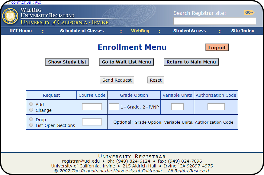
Used to enroll, drop, and waitlist for classes by inputting a course's respective course code

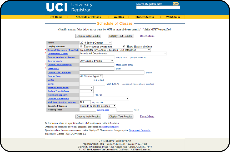
Used to search and filter though available classes and obtain course enrollment codes used in WebReg

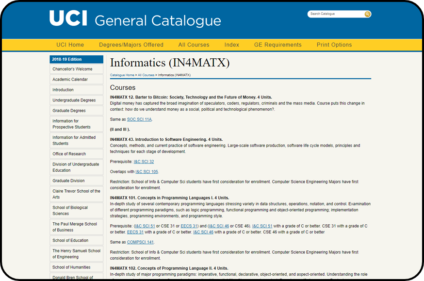
Used to view class prerequisites and course descriptions

Used to enroll, drop, and waitlist for classes by inputting a course's respective course code

Used to search and filter though available classes and obtain course enrollment codes used in WebReg

Used to view class prerequisites and course descriptions
As part of a 10 week course, our 6 person team was tasked with redesigning an existing website, application, or other service. As current students who had to frequently enroll in classes, we experienced first-hard the many usability issues present in the current enrollment. To inform our redesign decisions, we followed the process detailed in the figure below.

Our research began with a competitive analysis of direct and indirect competitors to the current UCI class enrollment process. Since our service is the sole product students must use to enroll in classes, it does not have any true competitors. However, there is still valuable information to obtain from a competitive analysis. Our goal for this step was to clearly define what our current service offers, understand what it does well and what can be improved on compared to other offered services.
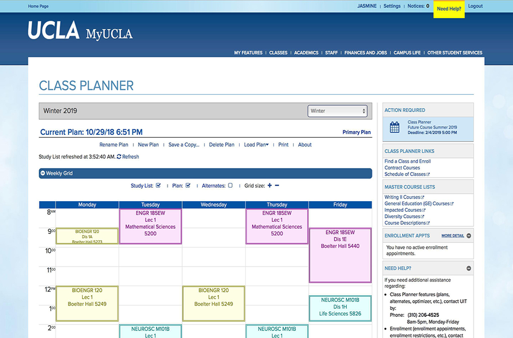
UCLA's enrollment website. All course enrollment actions (class adding, dropping, waitlisting) are found on MyUCLA. Features class planning, schedule visualization, and auto-enrollment
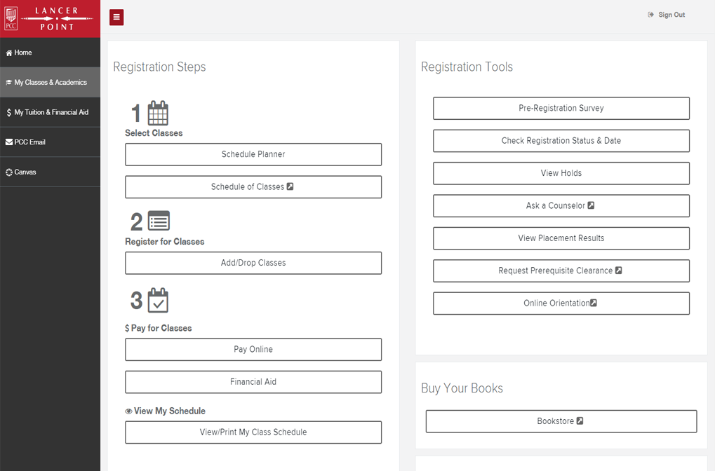
Pasadena City College's enrollment website. All course enrollment actions are found here. Schedule planning and payments are also handled on Lancerpoint.
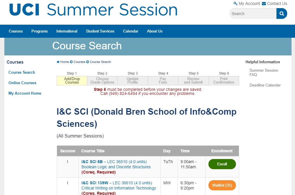
Website for enrolling in UC Irvine's summer courses. Enrollment actions, class information and course descriptions can be found on this website.
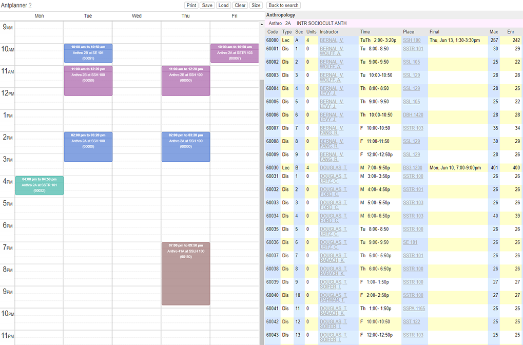
A third-party schedule planning/visualization service for UC Irvine students. Links to WebSOC to obtain class information.
When comparing UCI’s enrollment system to these competitors, it became clear our system had many shortcomings. From this competitive analysis, our team was able to gather the following ideas for our redesign including:
After getting a better understanding of our service’s place among its competitors, our next step was to learn about our users. Naturally, our target population was UCI students, those who must frequently enroll in courses at UCI. Our research targeted both undergraduate and graduate students. In researching our users, our goals were to discover frustrations students have when enrolling in classes, understanding where efficiency is lost when enrolling, and learning what students do to make enrolling easier.
Our team conducted 14 interviews over the span of a week. We asked participants about the process they used when enrolling in classes, other websites they used while enrolling, and what they believed could be improved about the enrollment process. We made sure to ask follow-up questions to dig in and identify their pain points.
For a wider reach, our team released a survey consisting of 18 questions. The survey begins with demographic questions, then transitioning to multiple choice and rating questions. These questions also asked about the process that users’ used to enroll in classes and to rate different aspects of the enrollment process on scale from 1-5.
The survey was available for 72 hours and had a total of 33 responses. Those who took the survey were friends of our group members and willing participants on different UCI Facebook pages. The survey was created on Google Forms and prompted the user to statement of informed consent before participating.
From our interviews and surveys, we concluded that users do not necessarily find the current system difficult to use. However, although the overall process itself is quite simple, a major pain point for users is how long the entire process takes. When asked about what other websites our participants used outside of the main three, over 70% stated that they used a schedule planning/visualization service like Antplanner or Zotcourse. Responses to our interviews and surveys revealed a strong desire for the unification of all three websites and native support schedule planning and visualization.
Our interviews and surveys helped us identify frustrations users have with the enrollment system and learn what process our participants used to enroll. To discover the exact usability issues present in the to address in our redesign, we conducted usability tests and a cognitive walkthrough.
We ran 6 usability tests where participants completed tasks related to enrolling in classes, dropping classes, in searching for course information. Users were limited to completing each tasks using only WebReg, WebSOC and the UCI General Catalogue. We limited our participants to freshman and first-year transfer students to minimize familiarity with the current system. As WebReg is not available until the end of the academic quarter, tasks relating to WebReg had to be done using a wizard-of-oz prototype with multiple screenshots printed on paper.
Our team conducted a cognitive walkthrough which involved enrolling and waitlisting for classes. Similar to our usability tests, we had to use a wizard-of-oz prototype for WebReg related tasks. The entire process took slightly over an hour. By talking to each other during the cognitive walkthrough and analyzing user actions and intentions at each step of each task, we were able to gain further insight of the usability issues present in the current enrollment system.
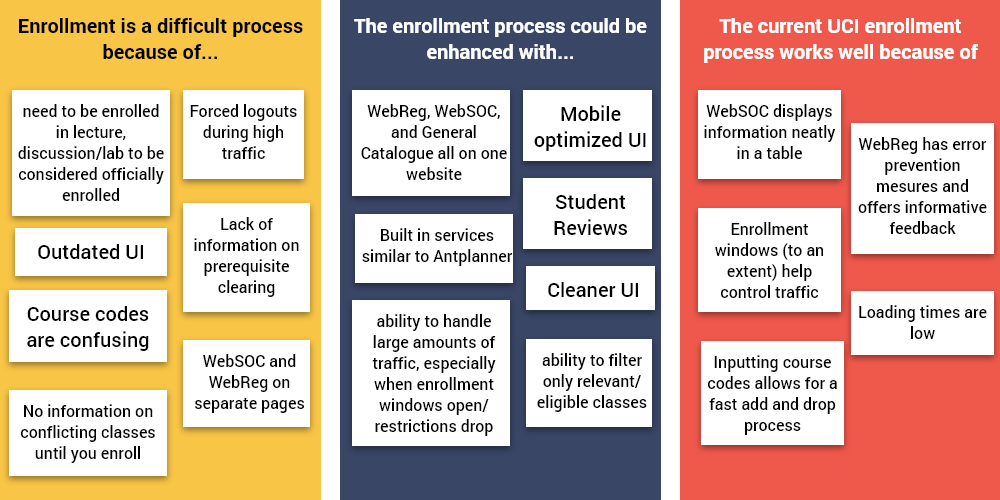
From observing our participants and discussing amongst ourselves, we indentified 3 key usability issues:
To begin the design process for MyUCI, each member of our team individually sketched their own idea of the overhauled system. We kept in mind the following design targets that were must-haves in our redesign:
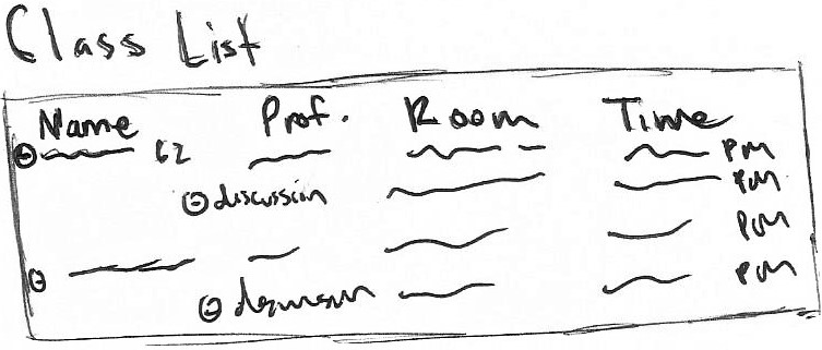
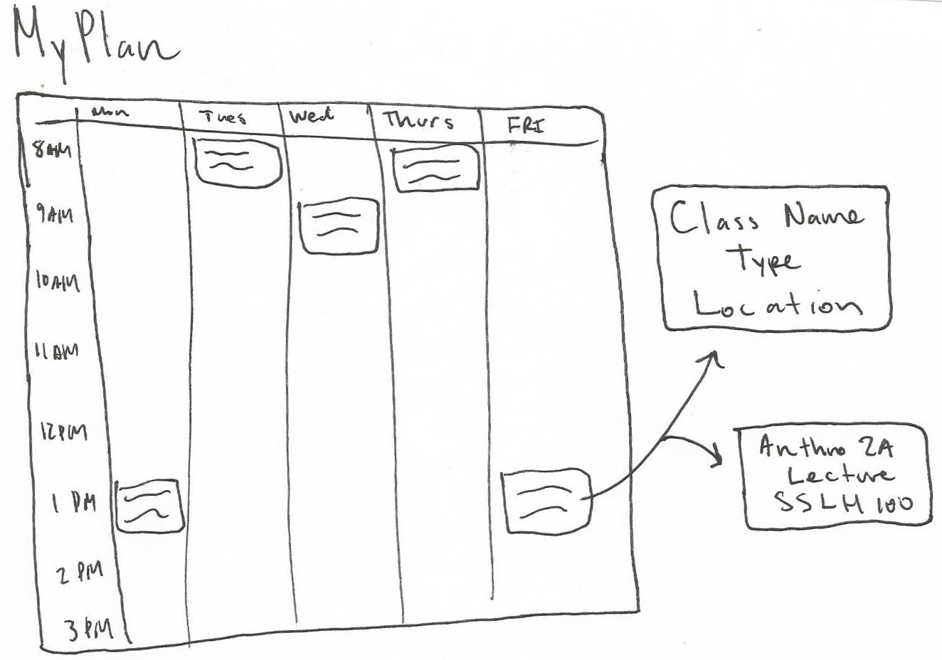
Below are designs I sketched aimed at tackling these design targets:
After presenting our sketches to each other, our team compiled what we saw as appropriate for MyUCI's final design. The ideas that made it into the final mockups had to tackle our design targets while integrating well with each other. These are a select few screens from our final mockups which encapsulate the final redesign.
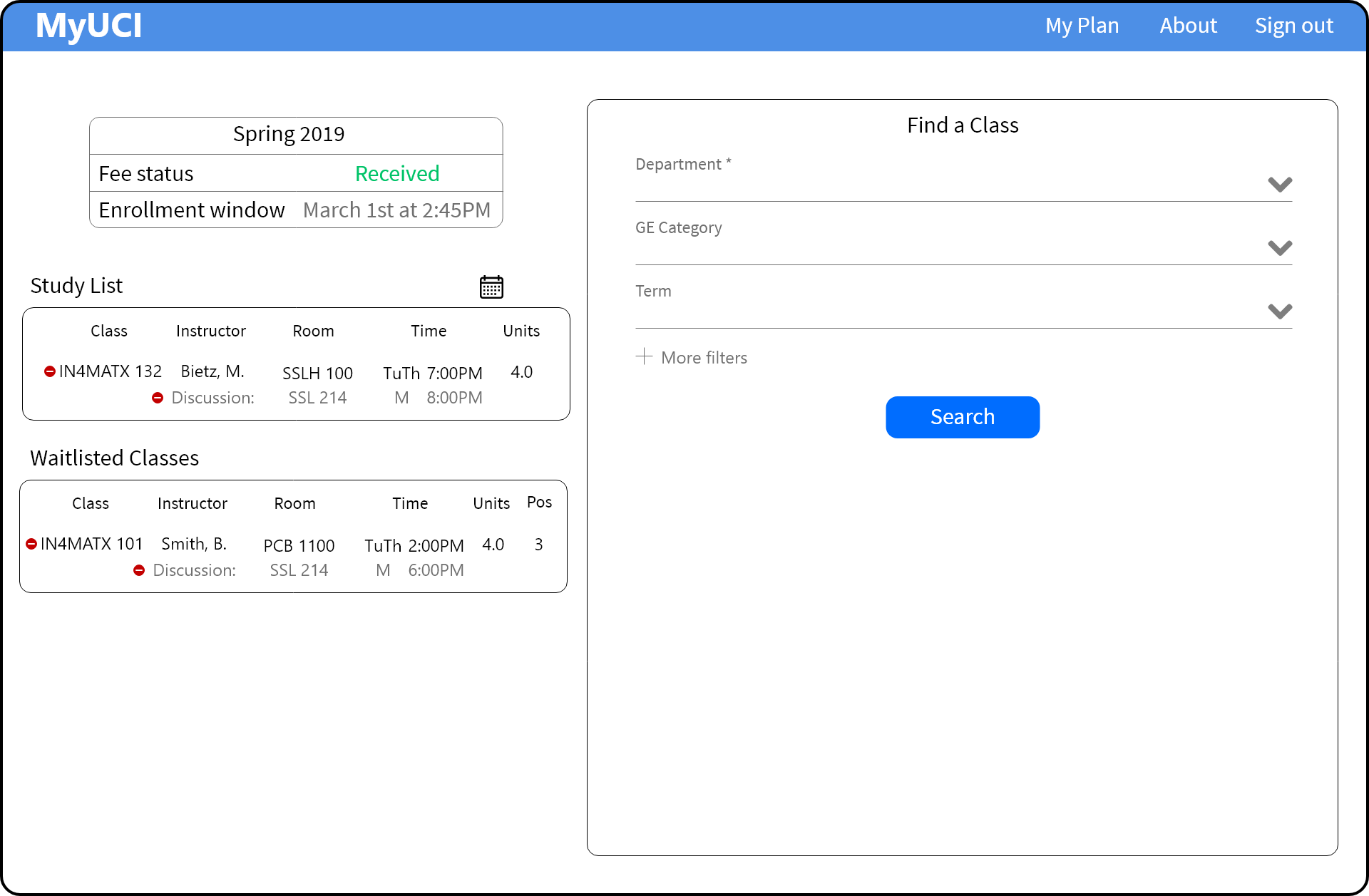
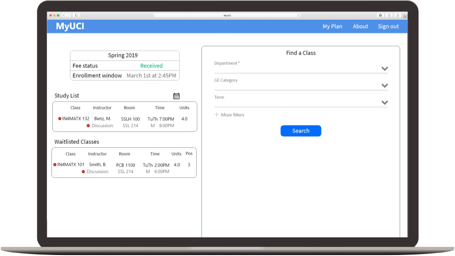
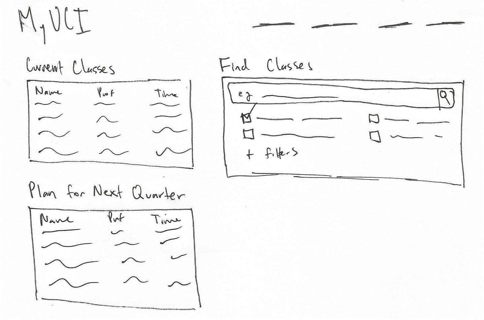
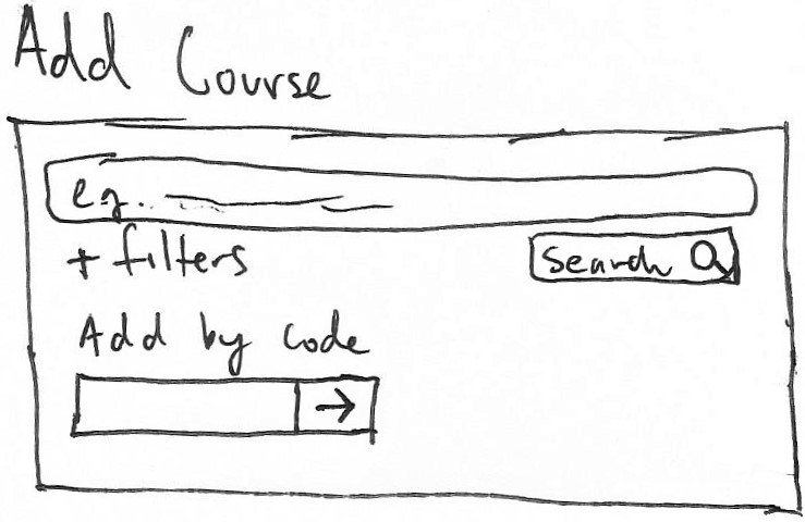
In designing the home page, it was crucial that it be intuitive and familiar. It is split into two sections, the left side displays information upfront that was previously hidden in WebReg. It also shows the student's current enrolled and waitlisted classes which users can drop by simply clicking the red minus buttons. The right side is where the user searches for available classes. The layout of the right side is similar to WebSOC but cuts down heavily on rarely used filters.
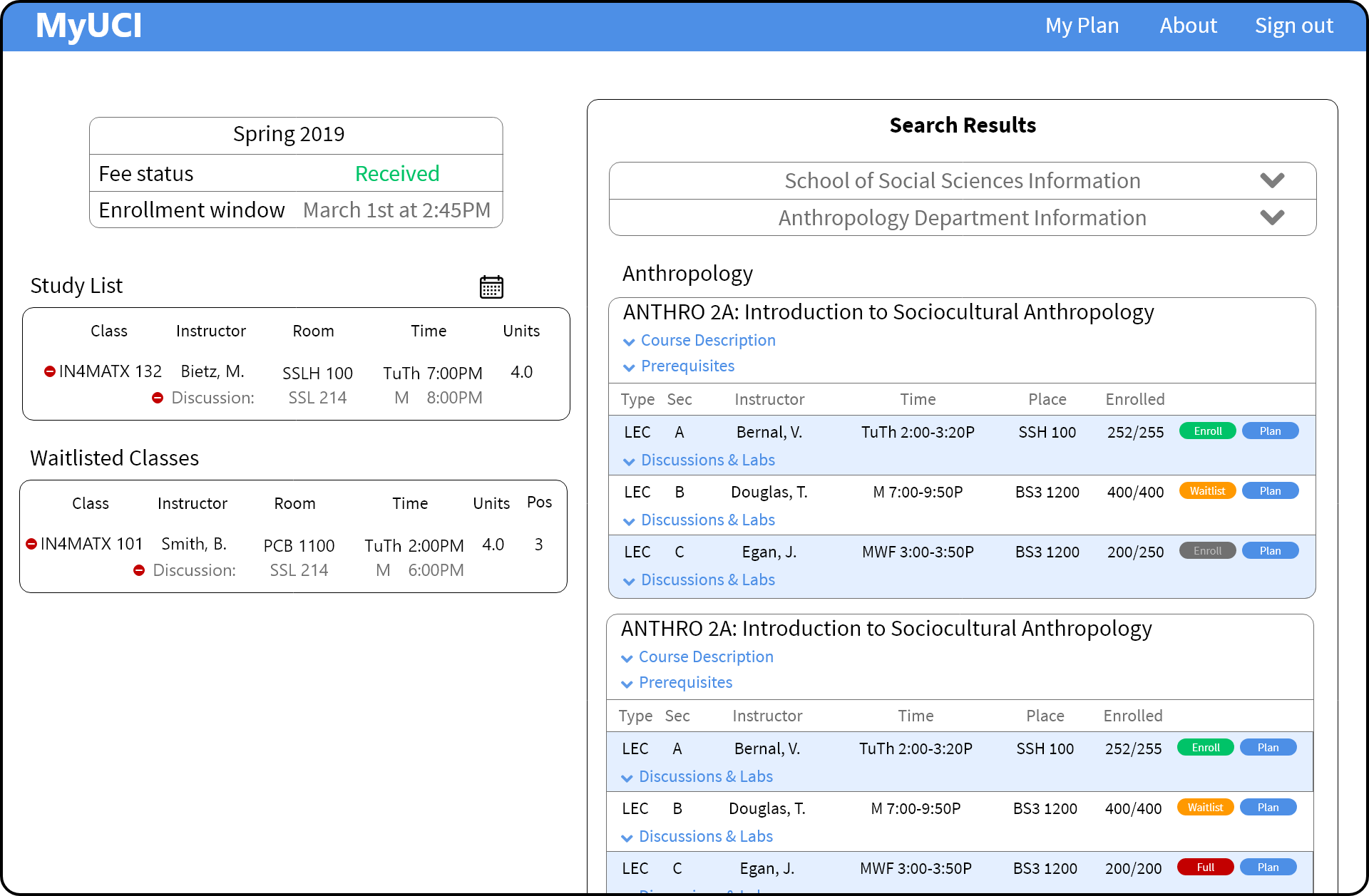
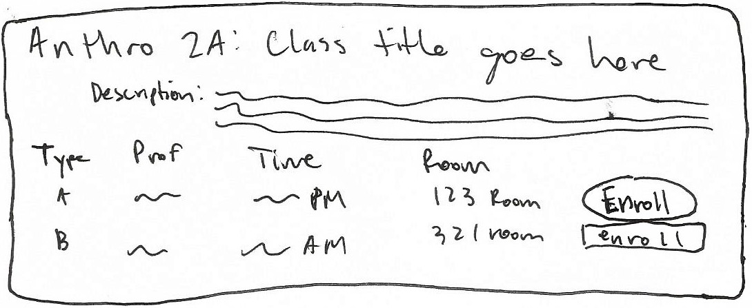
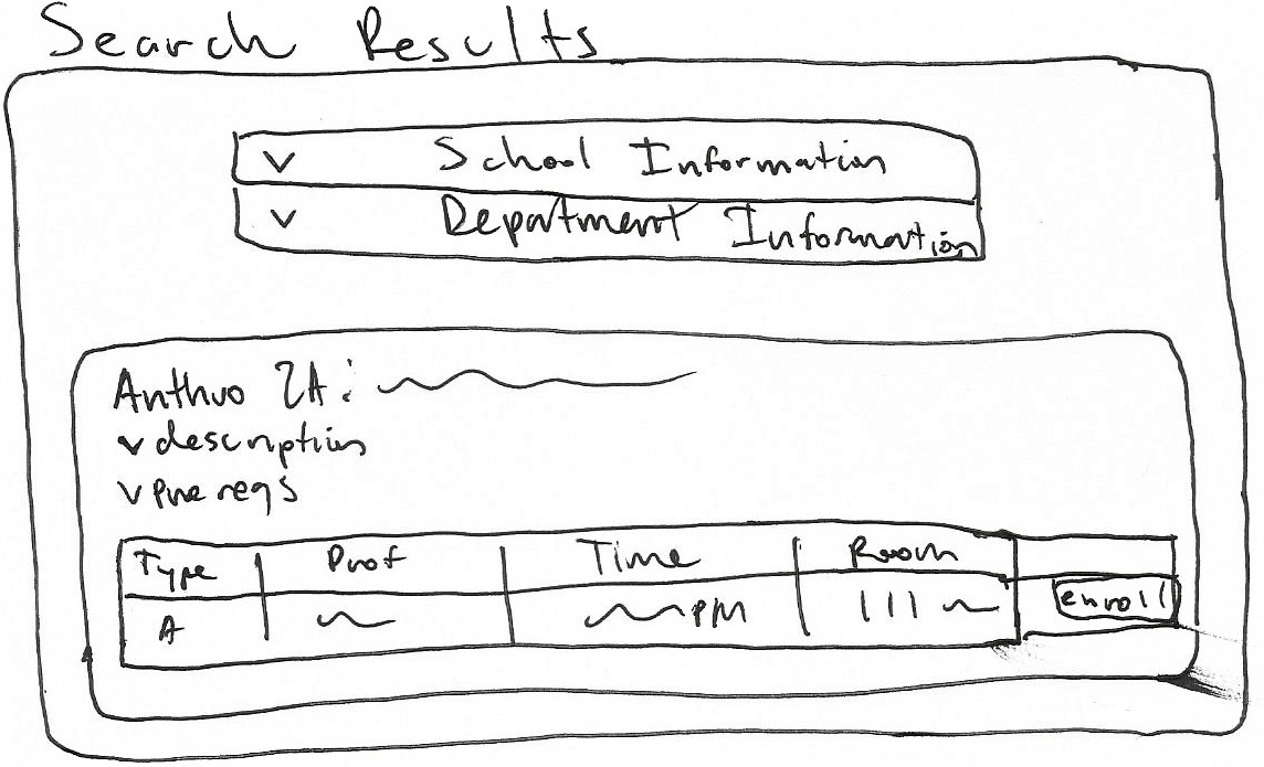
Integrating from WebReg, WebSOC, and the General Catalogue, the search results screen allows users to view course descriptions, class information, and enroll in classes with one click. This integration reduces the high amounts of clicking between screens present in the current UCI enrollment system. This design also reduce short-term memory load by eliminating the need to remember course codes.
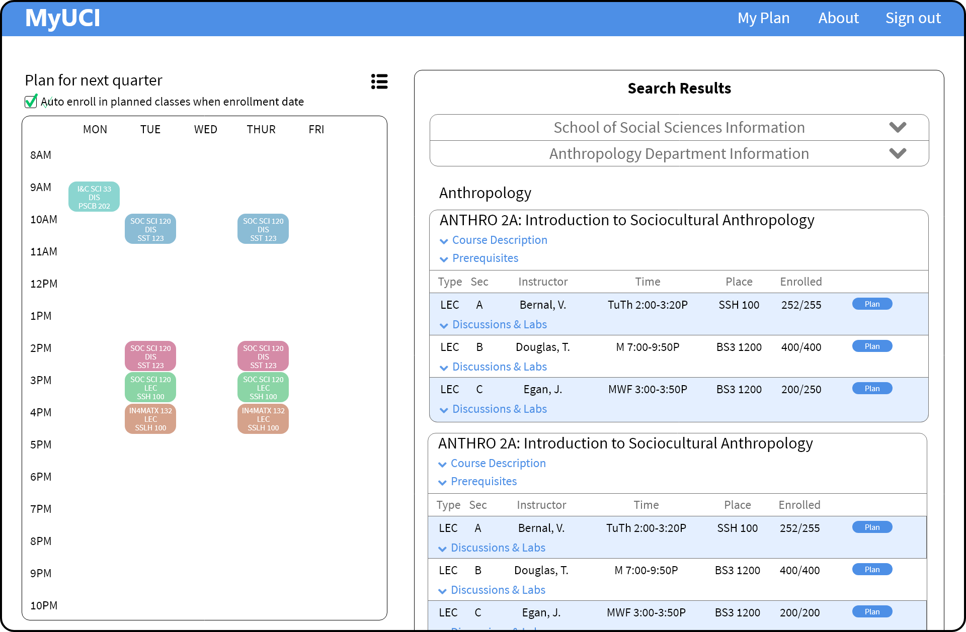
With overwhelming evidence supporting the need for this feature to be supported natively, schedule planning and visualization was a must-have in our redesign. Working similar to Antplanner, it allows students to add to their plan but clicking the "plan" button in the search results. This improves the user experience by eliminating the need to use a third-party service and reduces clicking between screens.
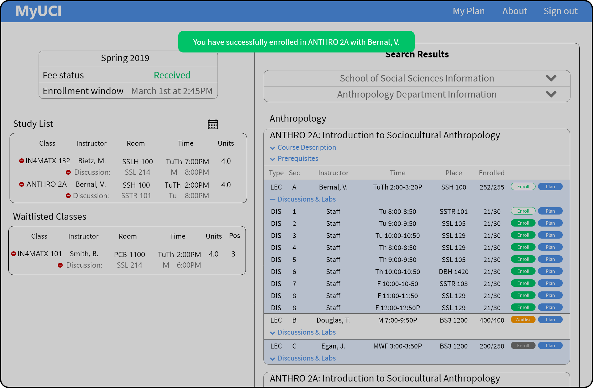
Although not a major finding in our research, the addition of these screens into our design is in following established HCI principles. Simple "are you sure" and "you have successfully" messages are not present in the current UCI enrollment system. Adding these simple modals prevents errors and offers the user informative feedback on their actions.
In designing the home page, it was crucial that it be intuitive and familiar. It is split into two sections, the left side displays information upfront that was previously hidden in WebReg. It also shows the student's current enrolled and waitlisted classes which users can drop by simply clicking the red minus buttons. The right side is where the user searches for available classes. The layout of the right side is similar to WebSOC but cuts down heavily on rarely used filters.
Integrating from WebReg, WebSOC, and the General Catalogue, the search results screen allows users to view course descriptions, class information, and enroll in classes with one click. This integration reduces the high amounts of clicking between screens present in the current UCI enrollment system. This design also reduce short-term memory load by eliminating the need to remember course codes.
With overwhelming evidence supporting the need for this feature to be supported natively, schedule planning and visualization was a must-have in our redesign. Working similar to Antplanner, it allows students to add to their plan but clicking the "plan" button in the search results. This improves the user experience by eliminating the need to use a third-party service and reduces clicking between screens.
Although not a major finding in our research, the addition of these screens into our design is in following established HCI principles. Simple "are you sure" and "you have successfully" messages are not present in the current UCI enrollment system. Adding these simple modals prevents errors and offers the user informative feedback on their actions.
Although we had a short 10-week window to complete research and design, I am very happy with how the project turned out. Similar to my teammates, this project was the first time I had used UX methods in research and design throughout an entire project. It was a great learning experience, especially in interacting face-to-face with users through interviews and usability tests.
Working and collaborating in a team was both challenging and very rewarding. Managing schedules, resolving disputes, and delegating work were complications we faced, but was well worth the trouble as we were able to still work well together and deliver and final deliverable we were all proud of.