As the sole designer on this product, I was tasked with redesigning the process for assigning and distributing required content (assessments, policies, trainings) in a course and learner management system.
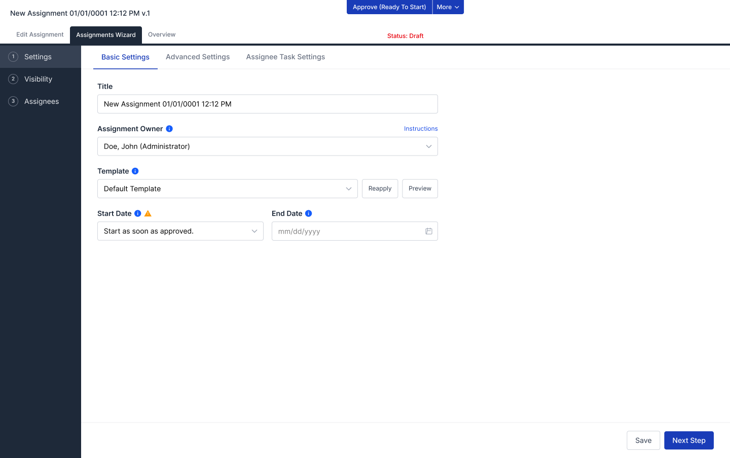
The product distributes required content (assessments, policies, trainings) to employees who must complete or attest to it. In the existing product, our users would have to use a dense, settings-heavy interface built for power users created over 10 years ago.
The current design best fit the use case of a full-time power user who creates and manages content assignments on a daily basis. But a large share of actual users were admins who typically assigned required content around once a year. For them, every extraneous page and every unused setting is a place to stall, second-guess, or make a mistake. That unneeded complexity was showing up directly in customer churn numbers.
I interviewed internal subject matter experts and product stakeholders (across product management, customer success, and content/training) to find the specifics about users’ issues. These interviews revealed pain points which fell into a few themes:
For an overview of the original flow, I mapped the existing assignment journey step by step and annotated each point with the question or friction it created.
The original flow:
Each step had its own sub-decisions and unexplained concepts, things that a once-a-year user most likely won’t recall.
Main Takeaways
As a result of the interviews with SMEs and mapping of the old design, I created goals to guide my redesign.
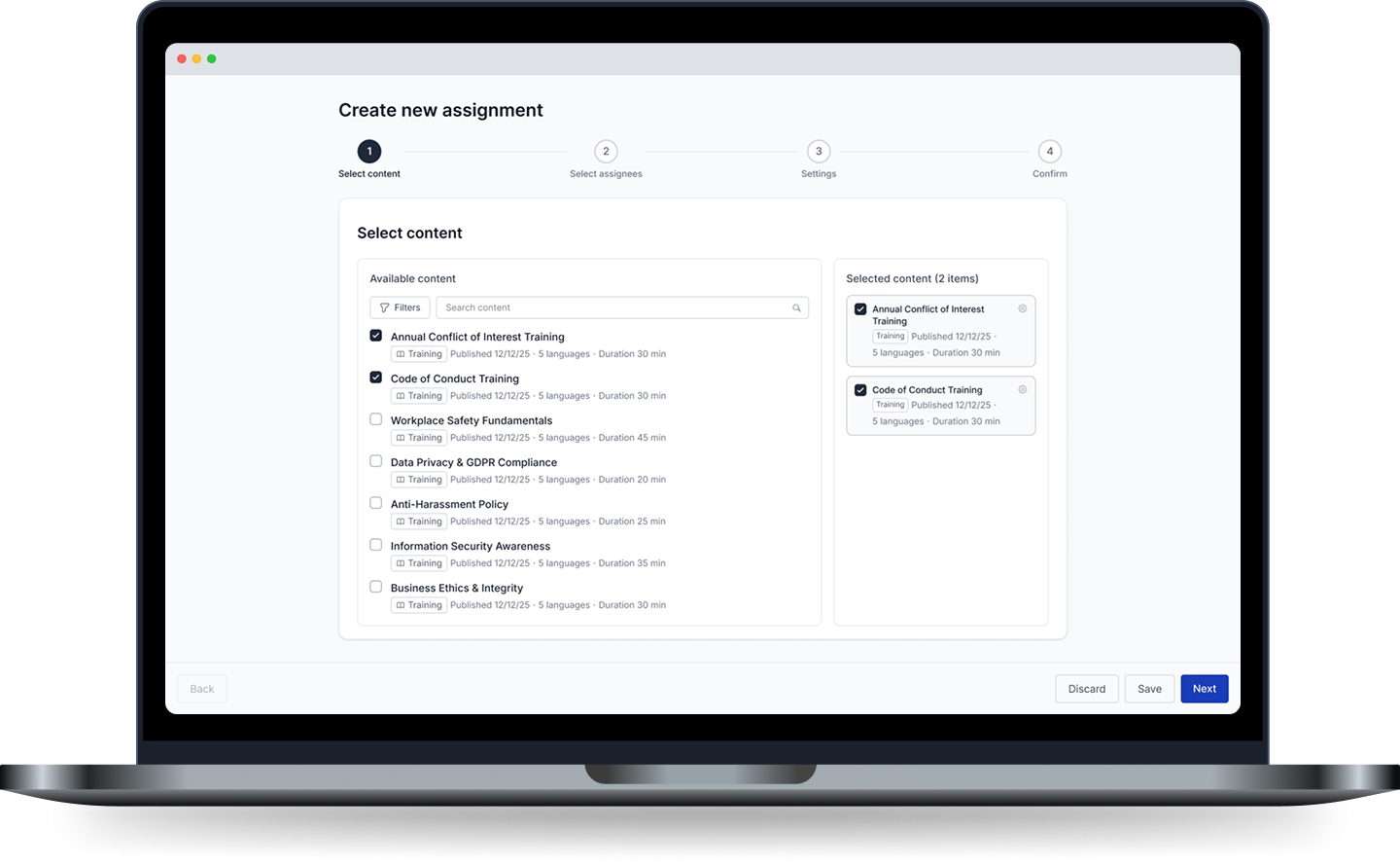
My new design is a questionnaire style flow that guides users through each step, while providing clear labelling and instructions, instead of dropping them into a complicated and dense settings page.
All assignment configurations are condensed into four core steps:
When compared to its competitors’ websites, the Ardent Academy website lacks a thoughtful user flow, focus, and calls to action. It displays information poorly through inconsistent and cluttered page layouts with an uninteresting visual presentation.
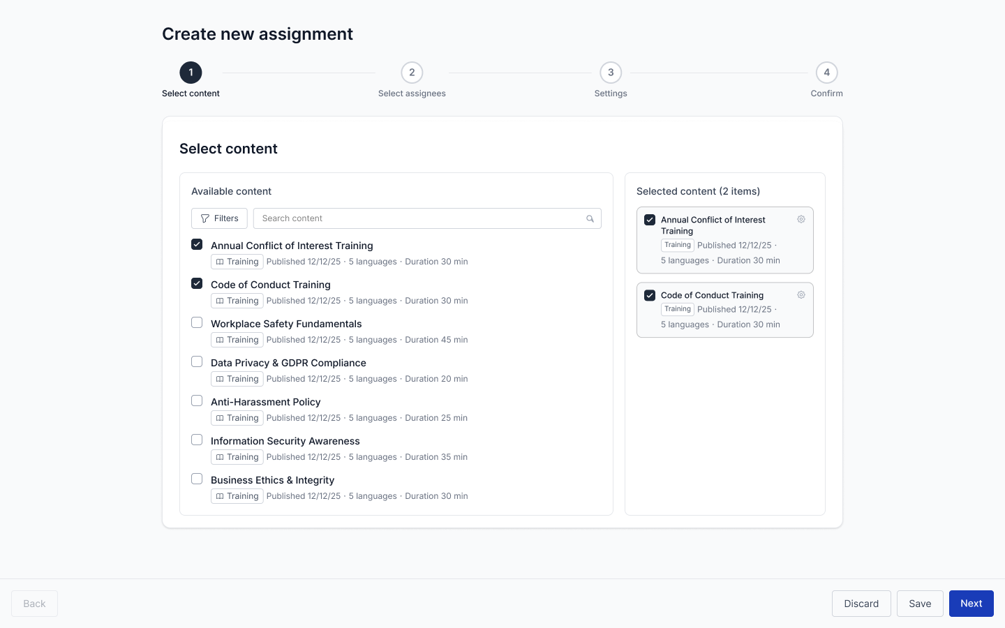
After selecting Select Content as their starting point, users select which content they would like to assign. Users could search and filter by content name and types. Available Content and Selected Content are separated so users can see a running selection of what they’ve chosen.
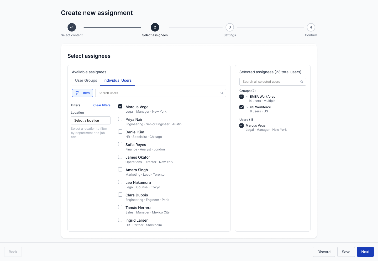
Users can select who they would like to assign the selected content. Users use tabs to select by either Individual Users and User Groups. The assignees can be filtered by their location, job titles, departments, or custom groupings. I included the ability to “skip” individual assignees, in the case that admins would like to select a group but exclude a couple of users in that group. This was a highly requested feature.
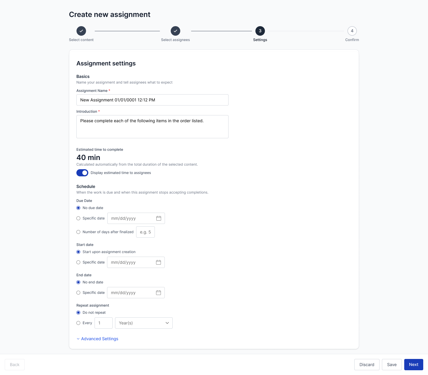
All settings related to the assignment are configurable from this page. Settings have been grouped (basics, schedule, advanced) for findability. The most important, most used settings are surfaced.
Default values are selected based on the most likely selections. This allows users who are unsure or don’t typically adjust certain settings to not have to consciously make a selection.
All previously available settings are now in a collapsed “Advanced settings” section. The focus here was visual hierarchy and progressive disclosure, so that we have feature parity with the legacy design without the complexity getting in the way of our typical users.
I made the key decision to reduce the use of modals. The old design made excessive use of them and there were many instances of modals on top of modals. By using modals more sparingly, information and controls are surfaced and hidden more thoughtfully.
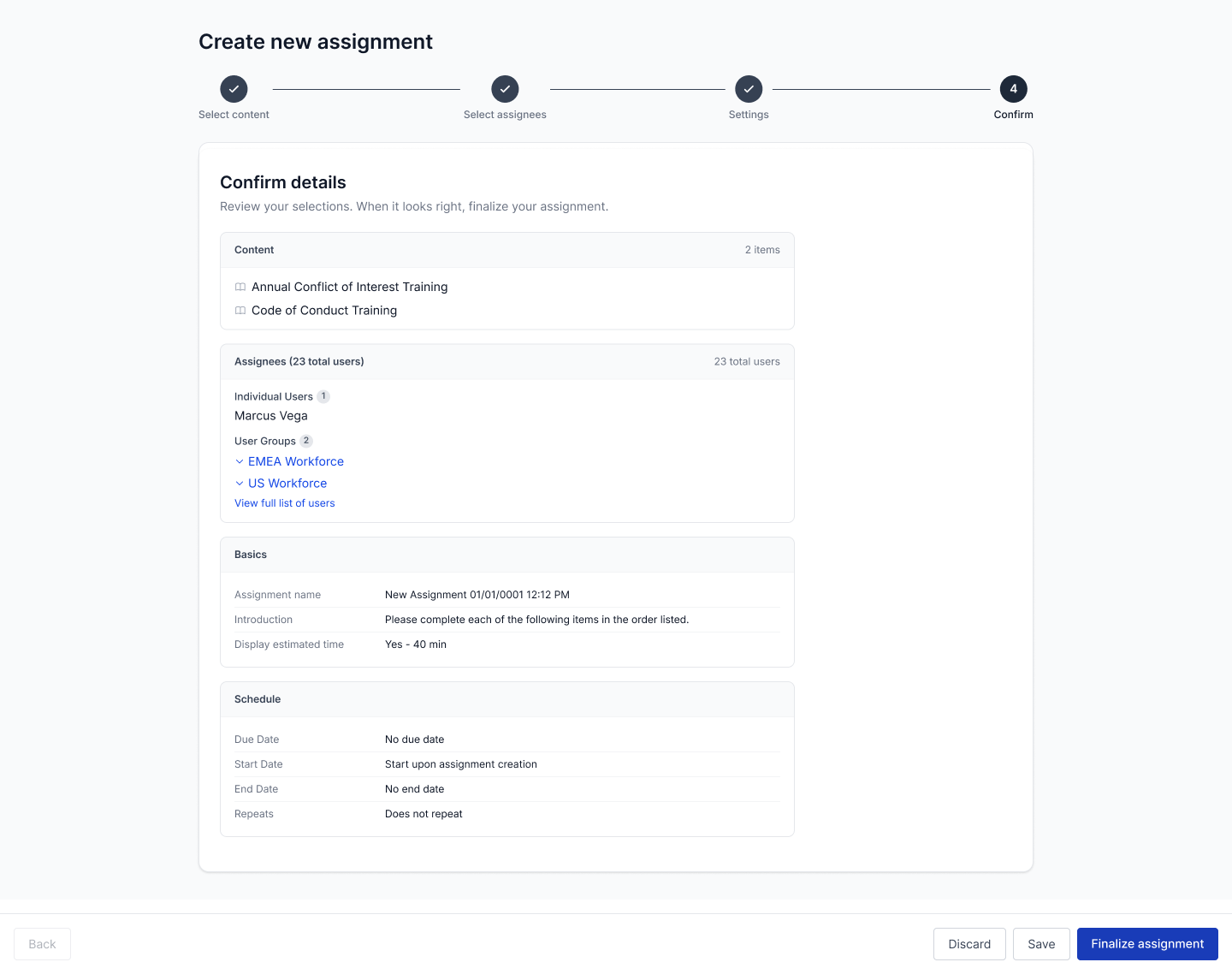
Last is a confirmation screen organized into Content, Audience, and Settings, so the whole assignment can be verified before committing. The old flow didn’t give an overview of all the user’s choices before completion. A mistake in this task could mean sending a mistake to thousands of assignees. This step shows the full who/what/when reviewable before completion.
I used Claude Design for ideation and rapid prototyping, moving quickly from high fidelity mockups to a fully clickable prototype. I used this prototype to quickly validate and iterate concepts with stakeholders. I also used the prototype for the next phase, moderated usability testing. conduct moderated testing.
I conducted 30 minute moderated usability tests with 5 participants using the aforementioned prototype. I recruited customers who had previously made complaints about this content assignment flow. During the test, participants accessed the prototype and thought aloud while they completed the given tasks. Overall, the goal was to see whether a typical assignment could be completed without guidance and to catch exactly where people got confused or stuck.
When writing up the tasks, I had some there were specific things I was looking for:
Task 1 (Role- based assignment with an exclusion)
Create an assignment that trains Engineers on Data Privacy, excludes one named person (Jennifer Smith), sets a due date one week out and an end date two weeks out, and repeats every year.
Watched for: how they find audience exclusion, and what is their expected behavior for “repeats every year”.
Task 2 (Group plus a named individual user)
Create a non-repeating assignment covering all code of conduct content, assigned to all Vice Presidents in the company plus one named person (Jennie Chen), with a due date one month out and an end date two months out.
Watched for: how they add a named individual alongside a group, and what they expect to happen at the moment they finalize (who gets notified, and how)
Across five moderated sessions, every participant completed both tasks without difficulty, and all five described the experience as modern, intuitive, and faster than the old design. Notably, there was one participant who had never created an assignment before. He completed both tasks confidently and quickly, a direct signal that the guided flow is learnable for the new/once-a-year user it was designed for.
The findings translated directly into a design changes for the next iteration:
To begin the design process, I began by exploring ideas for the reused components of the website such as the navbar, footer, and newsletter signup. After feedback and iteration on those designs, I sketched out designs for each page, taking into account what I learned from my research.
Overall, I am happy with how the research and design phases went. The SME interviews were a great first step which gave me an in-depth overview of the issues users were citing with the current content assignment process. Learnings from those interviews were a great north star for what our redesign had to address.
Ideally, I would have loved conducting usability tests with more participants and more complex tasks. I was given a timeline of two weeks for participant recruitment and testing which limited the number of sign-ups. The tasks I wrote were also quite simple assignments.I think additional tests diving into advanced settings could have given us even more useful insights to iterate on.
Overall, this project has been a lesson on the importance of designing for your audience. The original design had a valid use case, but it did not fit with the majority of our users. That mismatch was such a big frustration for customers, it led to churn. Being able to create a new flow from the ground up, while keeping our audience in mind, allowed me to design a flow that was intuitive and easy to use for our audience, while retaining feature parity with the original design.