In a team of 2 designers, I redesigned our product’s task portal to present important information firstand give users options for organizing and sorting tasks how they want.
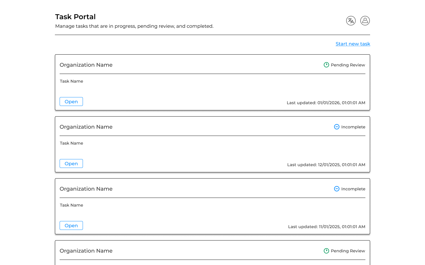
Our product is an enterprise SaaS platform used by organizations to manage and track tasks through a structured review process. The central hub of this platform is the Task Portal, where users can see all of the tasks they've been assigned, track their status, and pick up where they left off.
The Task Portal is a crucial part of the product but its design hadn't kept pace with users' needs. The initial design was very basic, simply showing a list of cards for each task sorted by when the task was last updated. As the volume and complexity of tasks grew, the design of the page made it difficult to find, manage, and track tasks.
To uncover the full scope of the problem, we conducted two rounds of research:
User Survey:
We surveyed 50+ users to understand their pain points and what improvements would make the most meaningful differences to their workflow. Survey responses indicated that users felt the default sort order didn’t surface the tasks they wanted and were frustrated by the inability to filter.
"“The most recently updated task is not always the most important or urgent task.”
Internal Stakeholder Interviews:
We interviewed 4 of our colleagues in product and customer success to understand what issues they heard most from users. Their feedback aligned with the survey findings and added context around edge cases, such as users who managed high volumes of tasks and were most impacted by the lack of organization.
Key research discoveries:
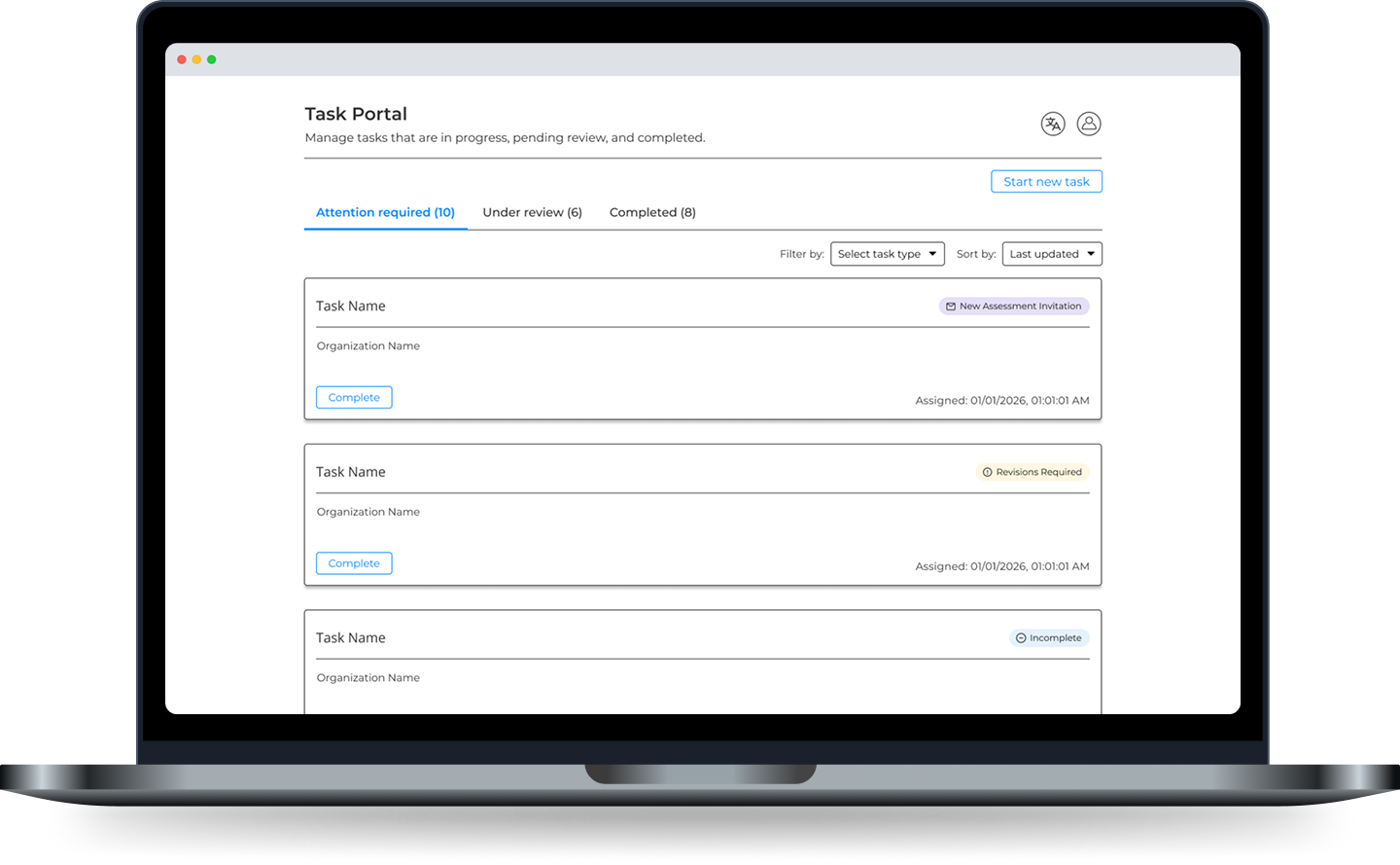
The biggest structural question was how to best organize tasks. Through iteration, we landed on a tabbed design. This decision helped to reduce visual noise and made the page feel less overwhelming for users with large task queues.
The tabs grouped related stages of the task lifecycle:
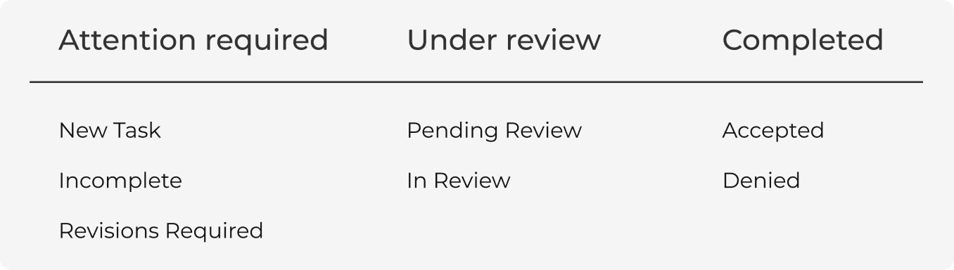
This grouping made the default view immediately actionable. Users land on Attention Required first, so they always see what needs their attention without hunting for it.
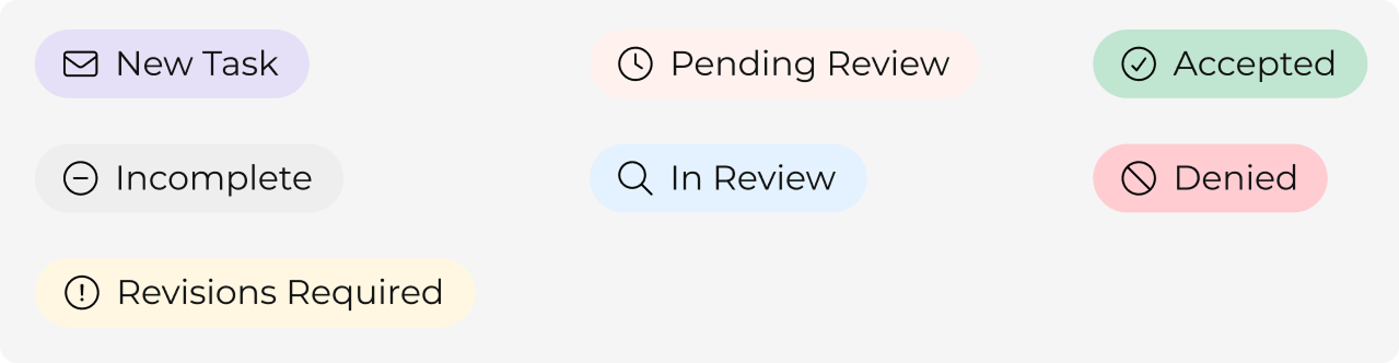
The existing cards had two problems: the wrong information was emphasized and the visual language was inconsistent.
We addressed both issues with:

With no filter or sorting options currently in the portal, we started by defining what would actually be useful for users. We focused on how users would typically want to narrow their task list with filters for task type, status, and organization. For sorting, we chose options for sorting by due date, last updated, and name.
With the redesigned portal, we focused on surfacing what mattered most, making it easy to find what you need, and visual consistency.
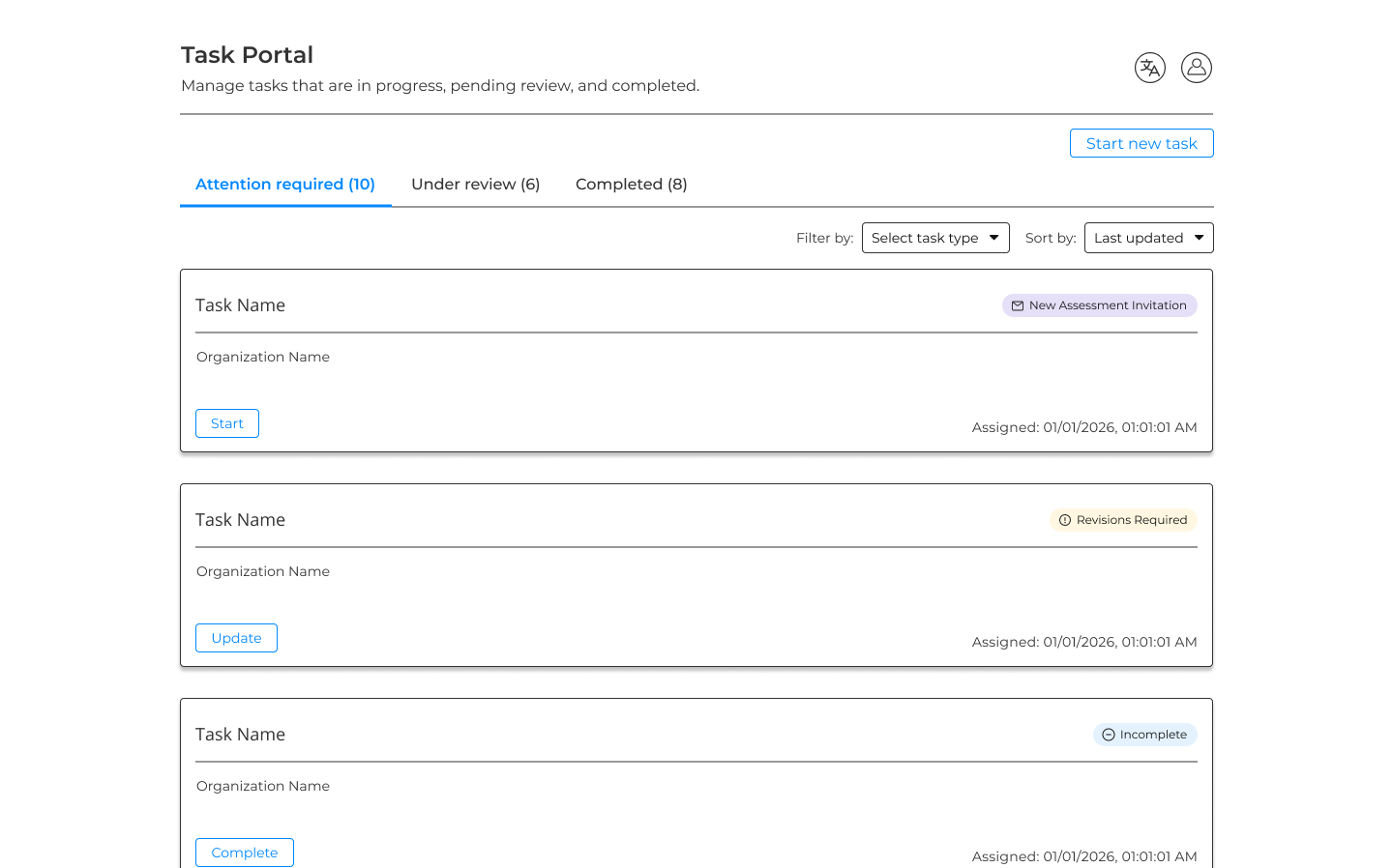
These were the key improvements:
The redesign shipped to production. Feedback has been positive with users noting that the new layout makes it easier to understand their task statuses at a glance and see urgent tasks first. Formal usability metrics still need to be gathered, but the qualitative feedback has been positive.
Working on this project, I learned how much small structural decisions (sort order or information presentation) shape the entire experience of a design. The shift to a tabbed, urgency-first layout wasn't a groundbreaking design, but it fundamentally changed how useful the page was.